
Pixar "Toy story: big escape"
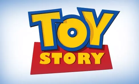
Game and fun - a great start. This logo, definitely, winner. The combination of red with yellow, font size and the playful location of letters encourages the viewer to view. In addition, it is pleasant to see the bulk logo hinting on the 3D format.
DreamWorks. "Ants ants"

The letter Z at the end reminds S. terrible! Perhaps this design was moden at the very beginning of the 90s, but in this case it's time to change the guidelines. In the picture I want to find a reflection of an exciting plot, but this is not. Ashamed.
Pixar "Monsters corporation"
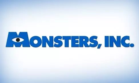
Large letters printed in bold on a blue background - are ideal for a large corporation. The logo seems uncomplicated, but at the same time, the blue color and the image of the eye hints on the characters of animation. Nicely.
DreamWorks. "Madagascar"
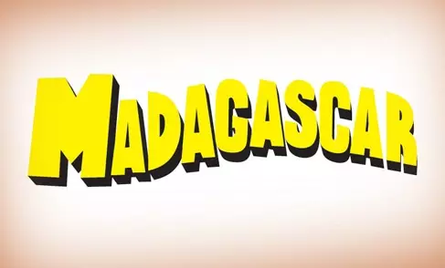
Card decoration, might attract attention. Could, but did not attract. I have not been worked out enough on the details. The logo is a stretched word in which the last letter R is explicitly separated from the main characters.
Pixar "Valley"
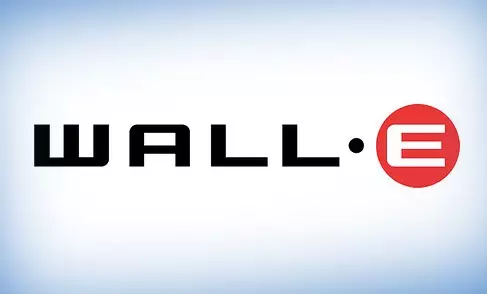
Fancy-cold logo style is pleasant to the eye. Especially after watching a cartoon about a small robot. Vall-and - a soulless car, created for monotonous and boring life on empty ground. What can better display the essence of such an animation? Sharp edges, the full disappearance of the charm in the picture and a red circle, hinting at an optical sensor in industrial equipment. It is worth noting the courage of the designer who separated the letter E with a bold point from the main text. Maybe showing that under the coarse shell is the soul.
DreamWorks. "Kung Fu Panda"

The shapes of letters are depicted in the form of traditional Chinese architecture (at home with its curved roofs), showing a connection with ancient martial art. The font in the style of "Asian" really attracts attention, but it looks too aggressive. There is no beveled red and yellow letters, throwing the shadow in theory should work, but for some reason not on this poster. In general, it is worth noting that this is not the worst logo.